Soundcloud made changes (and they are not just colors)
Soundcloud became lighter
Long story short: We now have menus with a white background instead of the background that used to be dark.
Soundcloud – love it or hate it – is rolling out tweaks that look visual at first. I noticed it the other day on my primary soundcloud, while it wasn’t there for some of the other ones like Dusk & Clouds just yet. As soon as I decided to analyze more and do a proper write-up, all of my accounts did have the new User Interface (UI). And more importantly - User Experience (UX). I think I can safely assume that it’s not a user test or A/B test anymore, and the changes are being rolled out globally.
People are averse to changes. It used to be a tough task to get accustomed to a page that suddenly turned from dark to a light color scheme (though most recently, the introduction of dark modes across a number of services did make the issue slightly smaller). And this is what Soundcloud changed visually recently. From the UI perspective, the immediate feeling was that it belongs more to the “content” part of Soundcloud instead of the “functional / settings” part now. I think we could debate where it is more logical to adhere to. Both options would seem to have merit, so I’m not going to try to debate it. The visual of the notifications dropdown menu does now have a light background and it’s probably not going away. And I know: it’s not just notifications (I think the main menu used to have a dark background as well). In this post, however, I am going to stick to the notifications section, as it seems the most important changes happened here.
And it’s a place we all tend to use (and abuse) most.
It’s making people act differently
Now I’ve implied that it’s not only visual changes. Soundcloud tries to change the way we consume information in the notifications dropdown and how we act on it.
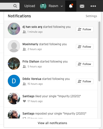

The information architecture of one notification entry became more consistent across different notification types. Now, each of them has a slightly bigger avatar picture, the type icon, the “who did what” line, and an action button (this is only for new followers). All good so far. We did lose a couple of information, though. The indication of a pro account has disappeared. (Edit: this was probably only a bug, the pro account icons are now visible). We also no longer see the information about the number of followers and the number of uploaded tracks. And that is a big one for me. Back in the days, it did kind of indicate the quality (really emphasizing the word “indicate” here, as it’s still only vanity metrics) of each new follower. I was more likely to click through to a profile with 60 uploads and 1000 followers over a profile with 2 followers and zero uploads. Again, I got to know fantastic people who had zero uploads and two followers on Soundcloud; as well as instantly unfollowed an account that had over 1k followers and 60 uploads. Why is this a big change for me? It forces me to check out every single notification. Every. Single. One. Forcing people to be curious is a good change in my eyes, even though it will take some time to get used to it.
Another big one is the highlighting of new notifications. As seen in the screenshot comparison, you now have a light grey background behind the unread ones. The mechanism seems weird to me and appears to be an afterthought. I get easily annoyed by an unread notification that I am not able to get rid of (looking at you, Tinder). To get rid of the new notification indicator (a.k.a. the orange dot), you have to open the dropdown by clicking on the bell icon, close the dropdown, and open again. Clicking the notifications does not seem to make them go away. Last but not least: You see more notifications now. Seems like it might be dependent on viewport size, but I can now see 5.5 notifications instead of 3. The new dropdown has a slider, so there are 9 notifications overall. Since I get a lot of notifications daily, I appreciate this change much.
One thing that seems to me like a less intended change and more a result of a technicality is the fact you are now not able to open the notification target in a new window. I would normally open all the notifications into a new tab with the help of CMD + click, which now opens the notification target in the same tab. Technology-wise it makes the life of Soundcloud much easier when you explore everything in one tab. Possibly, it makes you stay on the platform longer.
I say it’s a change we will like, with time
You will probably need some time adjusting to the changes like I did. Humans don’t like changes that much after all. This change is going to be good, as it forces users to explore and be curious. I’m personally pretty stoked to get to know more exciting people and discover new exciting music.
Even though it is going to (most likely) be an acquired taste.